The Challenge
The Three Counties Traditional Orchard Project is a Heritage Lottery-funded organisation that aims to restore 25 traditional orchards in key orchard areas in Herefordshire, Worcestershire and Gloucestershire.
Working with local experts it improves orchards for wildlife, discovers the role they have played over the centuries, helps to keep our traditional orchards as part of the landscape and trains volunteers in practical orchard skills.
The organisation needed branding that would help to create a distinctive identity and reinforce its aims.
The Solution
The representatives from Three Counties Traditional Orchard Project wanted a simple, clean logo that would work both online and in print.
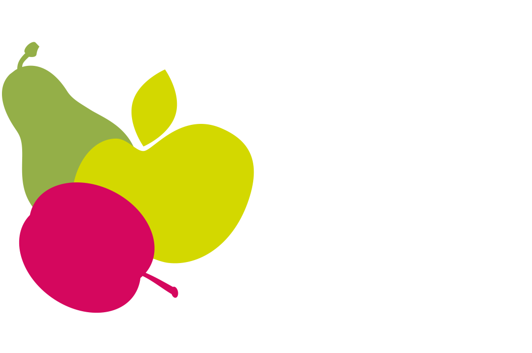
The logo features the three orchard fruits that are at the heart of the project: a plum, an apple and a pear. Aside from this, the use of the fruits also echoes traditional county emblems – Herefordshire is traditionally represented by an apple and Worcestershire by a pear.
The organisation is usually referred to by its initials – TCTOP – so it was important that the logo highlighted them. A warm, rustic typeface has been used, as befits a rural organisation.
Related Case Studies


